Original Penguin Fashion Redesign
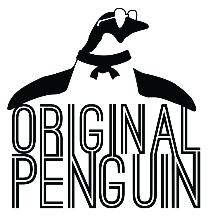
Original Penguin Redesigned Logo
Overview
This fashion brand redesign project for class was less of a complete brand overhaul and more of a turn in a slightly different direction. The men’s fashion brand had started to age, and could benefit from more exploration into a hip, urban look. The witty, classy, masculinity of the brand was something that definitely had to stay. Aside from a new logo and brand style guide, the redesign included a mall poster design, brochure, packaging element, and Facebook video ad.
Software(s) Used
Adobe Illustrator
Adobe Photoshop
Adobe After Effects
Adobe Premiere Pro

The Process
As stated above, the intent of the rebrand was not a complete overhaul, but just a slight change in direction to match the young, cool men who wear Original Penguin clothes. Beginning with research and a kit of parts, the new brand identity was formed. After that, various brand ventures were started, ranging from packaging pieces, to posters, brochures, and social media video ads. Research and the KoP documents can be found here.
The Logo
The original logo isn’t bad by any means, but the new one looks much more updated while also keeping that iconic penguin in the mark.
The Brochure
Conceived around an upcoming Summer Lineup, this brochure would be handed out at exclusive fashion events. It gives these exclusive patrons a Spring sneak peek at clothes coming in the Summer, and also provides them a code for a free pair of sunglasses. A full dieline can be found here.
The Poster
The promotional poster was conceptualized as a brand placement within a mall setting. It’s a bit of a visual pun with the whole ‘OK” gesture meme that’s been going around for a few years now, perhaps even longer. The young male target demographic would definitely get the joke, and it would show them that Original Penguin truly does understand them and their humor.
Sunglasses Box
Remember that code in the brochure that allows those exclusive patrons to get a free pair of sunglasses? Well this is the box it comes in. Designed to be reusable as a storage box, this packaging piece has a built-in slide-out drawer to hold the shades. At the bottom is a quick reminder to the wearer: “Keep It Cool.”
Social Media Video Ad
This animated ad was intended to be on Facebook’s platform, and take place chronologically after the Summer Lineup has started. It’s a simple ad showing off different articles of clothing, and was edited to be a perfect loop to assist with how video ads autoplay on Facebook.


